Toastmasters know the importance of a first impression. However, the first impression a prospective member gets of your club often happens before they even visit their first meeting. It’s formed when they visit your club website.
Think about the things you invest your time and money in: You probably check them out online first. The question is: Is your website helping or hurting? Does it tell people what they need to know about Toastmasters and your club? Or does it feature obviously outdated information like a promotion for an “upcoming” event that happened a year ago? Does it talk about Table Topics® (insider jargon) without explaining the relevance of impromptu speaking practice?
Here are some ways to make your club website a better marketing and recruiting tool.
Appeal to the Uninitiated
If trying to attract beginners, remember that prospective members may not know anything about Toastmasters. Or maybe they have heard of it and think it sounds deathly dull. A home page that emphasizes posed photos of people holding up certificates isn’t the best way to change that impression.
Instead, show Toastmasters in action. Use candid photos of dramatic moments from member speeches. Better yet, show video of members giving powerful (or hilarious) presentations. Let visitors know these speakers weren’t always that skillful but had the opportunity to learn in the safe and supportive Toastmasters environment. Show with images, show with video, but also put it in writing—about 600 to 800 words is a good target for the home page, both for the reader and to give search engines text to index.

Listen to The Toastmasters Podcast to hear more from David F. Carr.
Spell Out the Basics
Toward the top of the page, list where and when you meet. Since your website can be viewed by people anywhere, be specific. There is a world of difference between Melbourne, Florida, and Melbourne, Australia. If you allow or encourage online attendance, spell out not only the time, but the time zone. Make sure all your information is updated and accurate.
Think Mobile First
The majority of web traffic today comes from mobile phones, not desktop web browsers, so check how your club website appears on your phone. Are the essential details still visible and readable? Are images squished or not fitting within the browser window? Tweak as necessary to get that right.
Brand Yourself
Branding your local club is essential, particularly given the rise of online and hybrid clubs worldwide. You may be excited about the potential to recruit members from all around the world, but that also means you’re competing for attention with every other club in the world.
What exactly makes your club so special?
I was the first President at Online Presenters Toastmasters, which has grown into a successful 100% online club. At the top of our club’s home page, you learn that the club “serves those who give online presentations professionally, or aspire to do so, whether that means public webcasts and live video or internal company video conferences and screen sharing sessions.” That focus was distinct enough to bring in a strong base of members. Other online clubs have found success by focusing on specific skills, such as storytelling.
Branding your local club is essential.
My advice to hybrid clubs is to hold on to your local identity. Even if you decide to brand yourself as a club that welcomes remote members, or has established a topical specialty, you want to continue attracting people who are searching for a club within driving distance. Check the Toastmasters Brand Portal to ensure your site meets brand guidelines.
Search Engine Optimization
Search engine optimization (SEO) is the art of getting your website indexed in search engines and ranked as high as possible. Ideally, you want to rank for “public speaking” and “professional development” and other keywords, not just “Toastmasters.” Include those words in page titles, headings, and text.
George Marshall, DTM, of Fremont, California, one of the leading voices advocating for smart use of technology by Toastmasters clubs, offers a set of SEO tips focused on basics, like repeating meetings times and locations several times, on multiple pages. In addition, “Set up as many legitimate links to the website as you can, because Google counts those too,” he says.
Make sure to record your web address in Club Central on the Toastmasters website. See my more detailed tips on how to structure pages and links between pages.
Add Depth to Your Website
A full-featured, multi-page website gives visitors more pages to explore and search engines more content to index. If your website includes a particularly strong article on how speakers can improve body language or how to share slides more effectively on Zoom, that has the potential to rank on Google or get linked to by other websites.
Providing pages focused on individual topics, such as your club’s mentorship program, also gives visitors ways to learn more about your club and why it’s the right one for them.
The desire to add breadth and depth is what drove me to start the WordPress for Toastmasters project, originally for my home club, Club Awesome Toastmasters, in Coral Springs, Florida. WordPress is web publishing software originally created by bloggers for bloggers, so it’s easy to add articles. WordPress is always evolving and adding features for SEO, social media, and mobile devices. The trade-off is that there is always more to learn.
 An example of how to let visitors know how to find you.
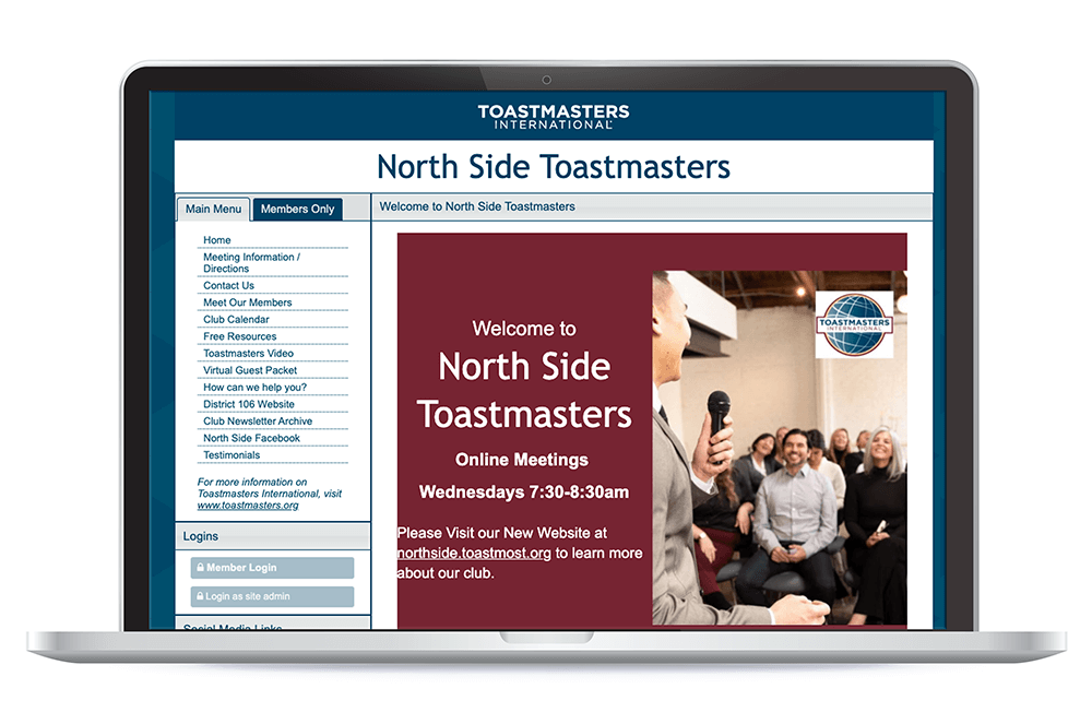
The Free Toast Host (FTH) web hosting service supported by Toastmasters International has the advantage of being specifically for Toastmasters. For example, the FTH website of North Side Toastmasters Club in Mounds View, Minnesota, makes excellent use of the Toastmasters brand colors to ensure its welcome message stands out. It helps that webmaster and longtime club leader Avonelle Lovhaug is a professional web developer.
Focus on One Thing
However, far from adding more special effects, Lovhaug says most club webmasters should use fewer of them. Many club websites use so many different fonts and background colors that the effect is chaotic.
While Lovhaug happens to be a professional, that’s not the case in many clubs. Toastmasters is a volunteer organization. No club webmaster can be expected to be a technical expert, a design expert, and a great web copywriter. Often, maintaining the website is one of many roles for the Vice President Public Relations or another club leader. They can’t be expected to make perfecting the club website into a full-time job.
Instead of a home page with fancy graphics, insider jargon, or inaccurate details, focus on one thing: making a strong first impression online.
David F. Carr, DTM is a writer, editor, and digital consultant based in Coral Springs, Florida. He is a member of Online Presenters and of Club Awesome in Coral Springs. He is also the founder of the WordPress for Toastmasters project and runs the Toastmost.org club website hosting service.


 Previous

 Previous Article

